Special Charts
Combination chart
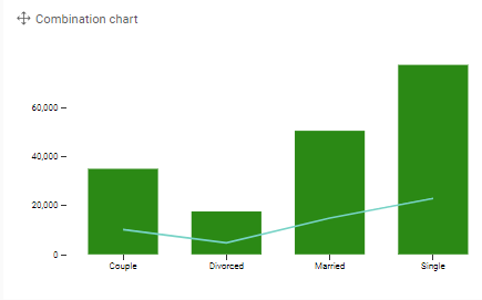
Characteristics:
- Visualize different measures by different visualizations
- Ordering is recommended
Example: Display the delivery count and open count per country.
Parallel coordinates
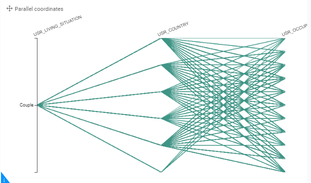
Characteristics:
- Find a link between different measures over a specific hierarchy (different lines and colors)
- Data preparation required: the values to be displayed should be pre-calculated available. In the settings of the graph it is not possible to make measure calculations, such as rates.
Example: Display the Open rate, Delivery rate and Click rate per gender
Venn diagrams
VENN diagrams are a powerful graph to visualize relationships or comparisons when having a dataset with multiple records for 1 entity or activity, such as a dataset representing clicks on communications (1 person may click on multiple campaigns), or a dataset representing sales (1 person can buy multiple products).
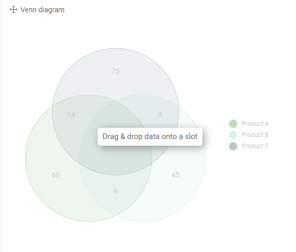
One-dimensional visualization helps you to count the number of activities per journey, product category or sales year. VENN-diagram helps you to identify intersections amongst these journeys, product categories or sales years.
Example 1 :
Contact activities on journey:
The Bar chart shows how many contacts have clicked on each of the journeys, while the Venn diagram identifies the contacts that have clicked on multiple journeys.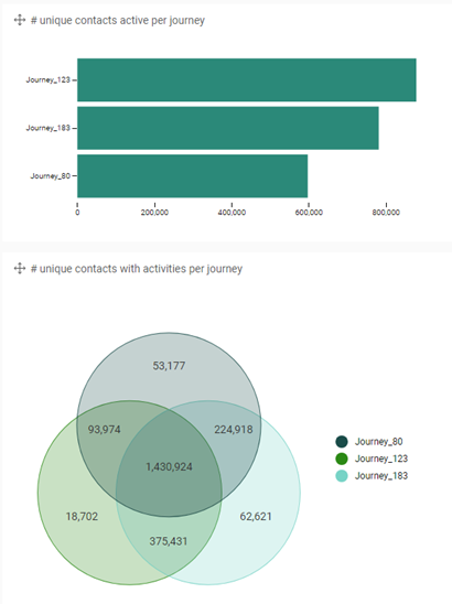
Example 2:
Buying of product categories:
The VENN allows you to identify who bought product category A and B, but not on C.
When the intersection between 2 product categories is high, it means that a lot of people bought items of both product categories. This identifies a relationship between the 2 product categories – which opens the door for upsell activities in case people did not yet buy the other product category.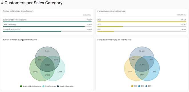
Example 3:
Identification of user groups.
When looking at transactional data and making a VENN-circle per sales year, it enables you to identify interesting user groups.
- Clients that only bought during the most recent year are new clients
- Clients that both in previous years, but not in the last year are churned clients
- Clients that both in 3 subsequent years are loyal clients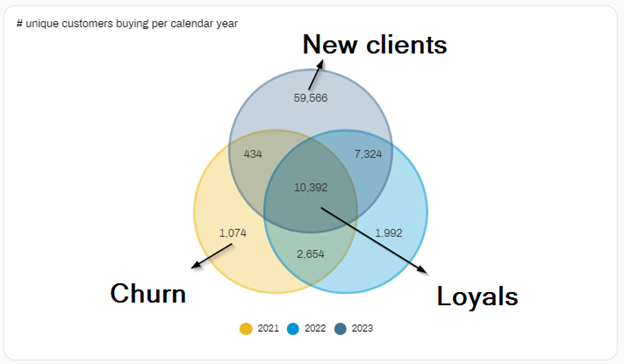
Bubble chart
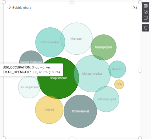
The Bubble Chart works as an eye-catcher, and is a nice visual for filtering, but is not very efficient. A bar chart will tell you a lot more in less space.
Characteristics:
- Displays 1 measure over 1 or 2 hierarchies.
- Category hierarchy is displayed in the bubble
- Coloring is adapted to the second hierarchy
- Can be used as a filter-option
- Bigger values pop out instantly
- No ordering between the hierarchies
- No ordering between the hierarchies
Example: The email open rate per gender and per age category.
Strip plot
Characteristics:
- 1 category-hierarchy with many entities (like journeys, users,…) can be plot over different axes to see how it behaves between other comparable entities.
- Only practical for online dashboard reading
Radar chart
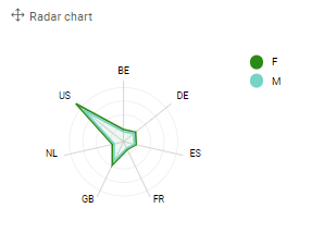
Characteristics:
- Comparison of 1 measure over 1 or 2 hierarchies.
- Can be used to display the outcome of surveys.
- Both hierarchies should have limited values
- The category-hierarchy is displayed on the radar and should contain limited values (best practice <10)
- The color-hierarchy displays individual surfaces on the radar and should contain limited values (best practice <4)
Pyramid
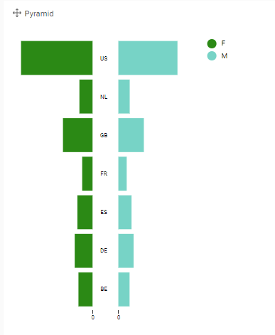
Characteristics:
- Comparison of a single measure between a 2-valued hierarchy (Category), spread over 1 hierarchy of multiple groups
- The 2-valued hierarchy can be used by applying a filter on the visualization.
- This is more used for an explanatory
Funnel chart
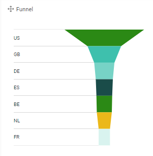
Characteristics:
- Overview of 1 measure split over 1 hierarchy
- Ideally to follow-up on a status of which the sequence is important
Alluvial
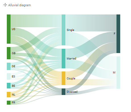
Characteristics:
- Compare the spread of multiple hierarchies over 1 measure
- Can be used for filtering too
Sankey
A sankey chart offers the possibility of showing flows and amounts of traffic. These flows are conditional. As such that the width of the streams are dependent of the quantity of the flow. As a tree the sankey breaks down in multiple branches. These branches could be divided into more subcategories. The chart will always indicate the size of connection between two or more subcategories, meaning the sankey diagram is best only used with the sum aggregation.
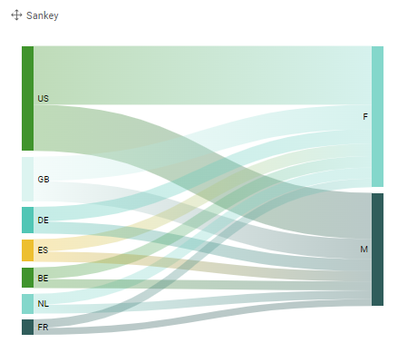
Characteristics:
- Two-leveled Alluvial with a measure spread over 1 source-hierarchy and 1 destination-hierarchy
- Can be used for filtering too
